Form validation
From this validation blog post
Validation consists of two separate libraries with robust set of standard behaviors and a simpler, more flexible API surface for easier customization:
aurelia-validation - a generic validation library that provides a ValidationController, a validate binding behavior, a Validator interface and more.
aurelia-validatejs - a validatejs powered implementation of the Validator interface along with fluent and decorator based APIs for defining rules for your components and data.
Install validation plugin
$ npm install aurelia-validation
Add validation to RegistrationForm
import {inject, NewInstance} from 'aurelia-dependency-injection';
import {ValidationController} from 'aurelia-validation';

@inject(NewInstance.of(ValidationController))
export class RegistrationForm {
  constructor(controller) {
    this.controller = controller;
  }
  // ...
The ValidationController manages a set of bindings and a set of renderers, controlling when to tell the renderers to render or unrender validation errors.
Configure the ValidationController
The default "trigger" that tells the validation controller to validate bindings is the DOM blur event. All in all there are three standard "validation triggers" to choose from:
blur: Validate the binding when the binding's target element fires a DOM "blur" event.
change: Validate the binding when it updates the model due to a change in the view.
manual: Manual validation. Use the controller's validate() and reset() methods to validate all bindings.
To configure the controller's validation trigger, import the validateTrigger enum: import {validateTrigger} from 'aurelia-validation'; and assign the controller's validateTrigger property:
controller.validateTrigger = validateTrigger.manual;
Implement the view-model's submit method. No matter which validation trigger you chose, you're probably going to want to validate all bindings when the form is submitted. Use the controller's validate() method to do this:
submit() {
  let errors = this.controller.validate();
  // ...
}
Define validation rules
At this point your view-model should look like this:
import {inject, NewInstance} from 'aurelia-dependency-injection';
import {ValidationController} from 'aurelia-validation';

@inject(NewInstance.of(ValidationController))
export class RegistrationForm {
  firstName = '';
  lastName = '';
  email = '';

  constructor(controller) {
    this.controller = controller;
  }

  submit() {
    let errors = this.controller.validate();
    // todo: call server...
  }
}
Let's bring in the aurelia-validatejs plugin which has APIs for defining rules and an implementation of the Validator interface that the ValidationController depends on to validate bindings. You can of course build your own implementation of Validator, one is in the works for breeze.
jspm install aurelia-validatejs
Now lets define some rules on our RegistrationForm class. You could use the decorator API:
import {required, email} from 'aurelia-validatejs';
// ...

export class RegistrationForm {
  @required
  firstName = '';

  @required
  lastName = '';

  @required
  @email
  email = '';
Or you can use the fluent API:
import {ValidationRules} from 'aurelia-validatejs';
// ...

export class RegistrationForm {
  // ...
}

ValidationRules
  .ensure('firstName').required()
  .ensure('lastName').required()
  .ensure('email').required().email()
  .on(RegistrationForm);
Add validation to our bindings
Now that the view-model has been implemented and rules are defined, it's time to add validation to the view.
First, let's use the validate binding behavior to all of the input value bindings on our form to indicate these bindings require validation...
Change value.bind="someProperty" to value.bind="someProperty & validate".
The binding behavior will obey the controller's validation trigger configuration and notify the controller when the binding instance requires validation. In turn, the controller will validate the object/property combination used in the binding and instruct the renderers to render or unrender errors accordingly.
Create a ValidationRenderer
We're almost done. One of the last things we need to do is define how validation errors will be rendered. This is done by creating one or more ValidationRenderer implementations. A validation renderer implements a simple API render(error, target) and unrender(error, target) (error is a ValidationError instance and target is the binding's DOM element).
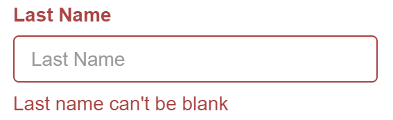
Since we're using bootstrap, we'll create a renderer that adds the has-error css class to the form-group div of fields that have errors. We'll also add a <span class="help-text"> elements to the form-group div, listing each of the field's errors. Here's the BootstrapFormValidationRenderer code and this is what a rendered error will look like:
Register the validation renderer with the component's controller.
Now that we have a render implementation we need to tell the controller to use the renderer. The aurelia-validate library ships with a validation-renderer custom attribute you can use for this purpose:
<form submit.delegate="submit()"
      validation-renderer="bootstrap-form">
You give the attribute the name of a renderer registration and it will resolve the renderer from the container and register it with the nearest controller instance.
At this point the view looks like this:
<template>
  <form submit.delegate="submit()"
        validation-renderer="bootstrap-form">

    <div class="form-group">
      <label class="control-label" for="first">First Name</label>
      <input type="text" class="form-control" id="first" placeholder="First Name"
             value.bind="firstName & validate">
    </div>

    <div class="form-group">
      <label class="control-label" for="last">Last Name</label>
      <input type="text" class="form-control" id="last" placeholder="Last Name"
             value.bind="lastName & validate">
    </div>

    <div class="form-group">
      <label class="control-label" for="email">Email</label>
      <input type="email" class="form-control" id="email" placeholder="Email"
             value.bind="email & validate">
    </div>

    <button type="submit" class="btn btn-primary">Submit</button>
  </form>
</template>
Form validation with Breeze
The aurelia-breeze plugin now ships with a custom attribute that automates the task of displaying all property-level and entity-level validation errors.
Consider the following bootstrap-style form bound to a Breeze Person entity:
<form submit.delegate="submit()">
  <div class="form-group">
    <label for="first-name">First Name</label>
    <input type="text" value.bind="entity.firstName"
           class="form-control" id="first-name" placeholder="First Name">
  </div>
  <div class="form-group">
    <label for="last-name">Last Name</label>
    <input type="text" value.bind="entity.lastName"
           class="form-control" id="last-name" placeholder="Last Name">
  </div>
  <button type="submit" class="btn btn-default">Submit</button>
</form>
We can display validation errors in this form by adding the new breeze-validation custom attribute to the form:
<form submit.delegate="submit()" breeze-validation.bind="entity">
  ...
</form>
The rest of the form markup does not need to change!
This is made possible by Aurelia's powerful templating and binding engines. The breeze-validation attribute is able to locate the two-way bindings on the form, determine whether the binding is to a Breeze entity property and discover the name of the property- even in complex binding expressions using value-converters!
The breeze-validation attribute can be bound to a single breeze Entity or to a breeze EntityManager instance for scenarios where your form is bound to multiple entities or validation errors could arise from other entities that aren't used in the form.
The logic that displays the validation errors lives in an implementation of the ErrorRenderer interface and is separate from the core logic of the breeze-validation attribute.
The aurelia-breeze plugin ships with a BootstrapErrorRenderer which you could use as the starting point for creating your own error rendering logic. For example, if you created a FoundationErrorRenderer that uses the Zurb Foundation CSS, you could register it in your Aurelia application's main.js by doing following:
import {ErrorRenderer} from 'aurelia-breeze';
import {FoundationErrorRenderer} from './foundation-error-renderer';

export function configure(aurelia) {
  ...
  ...
  aurelia.container.registerTransient(ErrorRenderer, FoundationErrorRenderer);
  ...
  ...
}
Do I need a <form> element?
No. You can put the breeze-validation attribute on any element and it will wire up the validation for any two-way bindings in the descendent elements.
Customization
You can customize the displayName of the property. By default it's the property name. You can set the display name to something more user friendly like this.
const custType = myEntityManager.metadataStore.getEntityType("Customer");
let dp = custType.getProperty("companyName");
dp.displayName = "My custom display name";
You could even write a routine to apply display names across all entity types and properties in the metadata store using a convention or manually maintained property-name to display-name mapping.
Customize the error message template. Look at Breeze validation docs for details
On the server, extend the standard breeze metadata with metadata pulled from your server-side entity's property attributes. Then on the client, apply the extended metadata as needed. Here is the code for this technique.