Advanced Composition
TODO: Widget designer with Dragula drag'n drop :)
From aurelia-dynamic-composition
One of my favourites parts of Aurelia is the compose element which allows you to dynamically render UI into the DOM. It is especially handy in situations where you want to dynamically render ViewModels inside of a loop like widgets or other dynamically composed elements.
Containerless
One of the lesser known features of the compose element is the ability to specify a containerless attribute on the element. By default if you use the compose element your page will feature the element with the rendered contents inside.
Sometimes you don’t want the compose element just the contents rendered inside because you might be using it to render table rows or parts in the DOM where the compose element would break the layout.
<template>
    <div repeat.for="widget of widgets">
        <compose view-model="widgets/${widget.type}.js" containerless></compose>
    </div>
</template>
This would render the contents of the composed view minus the <compose> element, cool huh?
ViewModel-less
Sometimes you might just want to render a HTML View and not concerned with ViewModel data. Using the view attribute we can render custom views without needing to specify anything else.
In the below example if the widget type property is table then the view loaded would be: table-view.html – as you can see we can dynamically compose views without needing to pass in a ViewModel. This means the composed elements becomes databound to the surrounding context which is embedding the element.
<template>
    <div repeat.for="widget of widgets">
        <compose view="${widget.type}-view.html"></compose>
    </div>
</template>
Supply data via view-model to
What good would being able to render custom components into your DOM be if you couldn’t pass in data as well? Using the model attribute we can pass in an object of data which becomes available in the ViewModel of our composed View.
Assuming our widget objects have a data attribute which has an object of data, we can specify our compose element passes through this data so it can be used within the view. You can also pass through a Javascript class filename to view-model which allows you to use lifecycle methods like activate (which gets the data as its first argument as an object) inside of your ViewModel.
<template>
    <div repeat.for="widget of widgets">
        <compose view="${widget.type}-view.html" model.bind="widget.data"></compose>
    </div>
</template>
Accessing model.bind data
To get data passed through to a <compose>`` element, you can specify acanActivateoractivate` method inside of your viewmodel and the first parameter gives you the supplied model.
export class MyViewModel {
    activate(model) {
        // model is the passed through object
    }
}
Auelia report builder
From report builder with Aurelia composition
What Is Visual Composition?
The basic idea of composition in computer science is to take small entities, in the case of object composition, simple objects/data types, and combine them into bigger and more complex ones. The same thing applies to function composition, where the result of one function is passed as the attribute to the next and so on. Visual composition shares this fundamental concept by allowing one to aggregate multiple distinct sub-views into a more complex view.
An important thing to consider when talking about visual composition is the difference between heterogeneous and homogeneous sub-items. In order to understand this, lets look at the following figure.
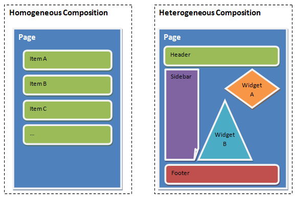
Homogeneous composition, as the name suggests, this is all about rendering items which have the same type and only varying content. This type of composition is used in most frameworks when creating repeated lists. As the example depicts, imagine a simple list of items being rendered sequentially one after another. On the right side we can see an example of heterogeneous composition. The major difference is the assembly of items which have different types and views. The example demonstrates a page consisting of several building blocks with different content and purpose.
A lot of frameworks offer that functionality via router-views, where specific view-regions are placed on the screen and different route endpoints are loaded up. The obvious drawback of this method is that the application requires a router. Besides that, creating complex view compositions can still become quite a tedious task, especially if you take nested compositions into account.
Aurelia on the other hand offers, in addition to the router-view, an alternative approach by exposing visual composition as a first-class feature via a custom element. That way it enforces the separation of concerns even on a visual level and thus leads the developer towards the creation of small and reusable components. The result is increased modularity and the chance to create new views out of already existing ones.
Using Aurelia’s Compose Element
In order to make use of visual composition within Aurelia, we can utilize the predefined compose custom element. It operates on one of Aurelia’s key conventions, the view and view-model (VM) pairs. In short, compose allows us to include a page at any particular position inside another view.
The following snippet demonstrates how to use it. At the position we’d like to include the Hello World page, we simply define the custom element and set the value of its view-model attribute to the name of the file containing the VM definition.
<template>
  <h1>Hello World</h1>
  <compose view-model="hello-world"
           model.bind="{ demo: 'test' }"></compose>
</template>
If we need to pass some additional data to the referenced module, we may use the model attribute and bind a value to it. In this case we pass on a simple object, but could also reference a property from the calling VM.
Now the HelloWorld VM can define an activate method, which will get the bound model data passed as an argument. This method may even return a Promise, e.g. in order to get data from the backend, which will make the composition process wait until it’s resolved.
export class HelloWorld {
  constructor() { }

  activate(modelData) {
    console.log(modelData); // --> { demo: 'test' }
  }
}
Besides loading the VM, the corresponding HelloWorld view will also be loaded and its contents placed into the compose element.
But let’s say that we don’t want to follow that default convention of VM and view pairs. In this case we can use the additional attribute view and point it to the HTML file we’d like to use as a view.
<compose view-model="hello-world"
         model.bind="{ demo: 'test' }"
         view="alternative-hello-world.html"></compose>
In this case the VM will still be loaded, but instead of loading hello-world.html the composition engine will insert the contents of alternative-hello-world.html into the compose element. Now what if we need to decide dynamically which view should be used? One way we can accomplish this is to bind the view attribute to a property of the calling VM, whose value will be determined by some logic.
// calling VM
export class App {
  pathToHelloWorld = 'alternative-hello-world.html';
}
// calling view
<compose view-model="hello-world"
         model.bind="{ demo: 'test' }"
         view.bind="pathToHelloWorld"></compose>
This is fine but might not fit each use case. What if the HelloWorld VM needs to decide itself which view it wants to show? In that case we simply let it implement a function called getViewStrategy which has to return the name of the view file as a string. An important thing to note is, that this will be called after the activate function, which allows us to use the passed on model data, to determine which view should be displayed.
export class HelloWorld {
  constructor() { }

  activate(modelData) {
    this.model = modelData;
  }

  getViewStrategy() {
    if( this.model.demo === 'test' )
      return 'alternative-hello-world.html';
    else
      return 'hello-world.html';
  }
}
Preparing the Project Setup
Now that we’ve seen how the compose element does its magic, lets get a look at the report builder application. In order to kick start the development, we’ve built it upon the Skeleton Navigation App.
git clone https://github.com/sitepoint-editors/aurelia-reporter.git
To complete the installation, please follow the steps listed under “Running The App” in the project’s README.
Creating the Report View
Our app’s entry point is the page app.html (located in the src folder). The VM (app.js) is just an empty class, pre-loading Twitter Bootstrap. The view, as depicted in the snippet below, acts as the main app’s container. You’ll notice that it composes the screen out of two separate pages called toolbox and report. The first acts as our container for various draggable tools whereas the second is the sheet you place those widgets on.
<template>
  <div class="page-host">
    <h1 class="non-printable">Report Builder</h1>

    <div class="row">
      <compose class="col-md-2 non-printable" view-model="toolbox"></compose>
      <compose class="col-md-10 printable" view-model="report"></compose>
    </div>
  </div>
</template>
Looking at toolbox.html we see that the view is outputting a list of available widgets alongside the buttons to print or clear the report.
<template>
  <h3>Toolbox</h3>
  <ul class="list-unstyled toolbox au-stagger" ref="toolboxList">
    <li repeat.for="widget of widgets"
        class="au-animate"
        title="${widget.type}">
          <i class="fa ${widget.icon}"/> ${widget.name}
    </li>
  </ul>
  <button click.delegate="printReport()"
          type="button"
          class="btn btn-primary fa fa-print"> Print</button>
  <button click.delegate="clearReport()"
          type="button"
          class="btn btn-warning fa fa-remove"> Clear Report</button>
</template>
The toolbox VM exposes those widgets by declaring an identically named property and instantiating it inside its constructor. This is done by importing the widgets from their respective locations and passing their instances — created by Aurelia’s dependency injection — to the widgets array. In addition an EventAggregator is declared and assigned to a property. We’ll get to this a bit later.
import {inject} from 'aurelia-framework';
import {EventAggregator} from 'aurelia-event-aggregator';

import {Textblock} from './widgets/textblock';
import {Header} from './widgets/header';
import {Articles} from './widgets/articles';
import {Logo} from './widgets/logo';

@inject(EventAggregator, Textblock, Header, Articles, Logo);
export class Toolbox {

  widgets;

  constructor(evtAgg, textBlock, header, articles, logo) {
    this.widgets = [
      textBlock,
      header,
      articles,
      logo
    ];
    this.ea = evtAgg;
  }

  ...
}
So what do those widgets contain? Looking at the project structure, we can find all of them inside the sub-folder src/widgets. Lets start with a simple one: the logo widget. This widget simply shows an image inside its view. The VM follows a default pattern by implementing the properties type, name and icon. We’ve seen those being used in the toolbox repeater block.
// logo.html
<template>
  <img src="images/main-logo.png" />
</template>
// logo.js
export class Logo {
  type = 'logo';
  name = 'Logo';
  icon = 'fa-building-o';
}
Looking at the textblock widget we see an additional activate method, accepting initial model data from the composition engine
// textblock.js
export class Textblock {
  type = 'textblock';
  name = 'Textblock';
  icon = 'fa-font';
  text = 'Lorem ipsum';

  activate(model) {
    this.text = model;
  }
}
In order to see how that model is made available to the view, lets take a look at the report page. What we see in its view is a mix of both homogeneous and heterogeneous composition. The report, essentially an unordered list, will output any widgets added to it — this is the homogeneous part. Now each widget itself has a different display and behavior which constitutes the heterogeneous part. The compose tag passes on the initial model, as well as the name of the sub-views’ view-model. Additionally, a remove icon is drawn which can be used to remove a widget from the report sheet.
<template>
  <ul class="list-unstyled report" ref="reportSheet">
    <li repeat.for="widget of widgets" class="au-animate">
      <compose
        model.bind="widget.model"
        view-model="widgets/${widget.type}" class="col-md-11"></compose>
      <i class="remove-widget fa fa-trash-o col-md-1 non-printable"
         click.trigger="$parent.removeWidget(widget)"></i>
    </li>
  </ul>
</template>
The removal is carried out by looking for the respective widget’s id and splicing it from the report.widget array. Aurelia’s repeater will take care of updating the view to actually remove the DOM-Elements.
removeWidget(widget) {
  let idx = this.widgets.map( (obj, index) => {
    if( obj.id === widget.id )
      return index;
  }).reduce( (prev, current) => {
    return current || prev;
  });

  this.widgets.splice(idx, 1);
}
Inter-Component-Communication via Events
We’ve mentioned that the toolbox has a Clear Report button, but how does that trigger the clearance of all the widgets added to the report page? One possibility would be to include a reference to the report VM inside the toolbox and call the method this would provide. This mechanism would however, introduce a tight coupling between these two elements, as the toolbox wouldn’t be usable without the report page. As the system grows, and more and more parts become dependent on each other, which will ultimately result in an overly-complex situation.
An alternative is to use application-wide events. As shown in the figure below, the toolbox’s button would trigger a custom event, which the report would subscribe to. Upon receiving this event, it would perform the internal task of emptying the widgets list. With this approach both parts become loosely coupled, as the event might be triggered by another implementation or even another component.
To implement this we can use Aurelia’s EventAggregator. If you look at the toolbox.js code snippet above, you can see that the EventAggregator has already been injected into the toolbox VM. We can see it in action in the clearReport method, which simply publishes a new event with the name clearReport.
clearReport() {
  this.ea.publish('clearReport');
}
Note that we could also pass an additional payload with the data, as well as have events identified via custom types instead of strings. The report VM then subscribes to this event inside its constructor and, as requested, clears the widgets array.
import {inject} from 'aurelia-framework';
import {EventAggregator} from 'aurelia-event-aggregator';
import sortable from 'sortable';

@inject(EventAggregator)
export class Report {

  constructor(evtAgg) {
    this.ea = evtAgg;
    this.ea.subscribe('clearReport', () => {
      this.widgets = [];
    });
  }

// ...
Use External Code via Plugins
So far we haven’t looked at the actual drag & drop feature, which we’re going to use to drag widgets from the toolbox onto the report sheet. Of course one could create the functionality via native HTML5 Drag and Drop, but why go reinventing the wheel when there are already a bunch of nice libraries such as Sortable out there to do the work for us.
A common pattern when developing applications is thus to rely on external code bases which provide out-of-the-box features. But not only 3rd party code might be shared that way. We can do the same with our own reusable features by leveraging Aurelia’s plugin system. The idea is the same. Instead of rewriting code for each application, we create a custom Aurelia plugin, hosting the desired functionality and exporting it with simple helpers. This is not limited to pure UI components but might be used as well for shared business logic or complex features like authentication/authorization scenarios.
Leverage Subtle Animations
In that vein, let’s take a look at Aurelia Animator CSS, a simple animation library for Aurelia.
Aurelia’s animation library is built around a simple interface which is part of the templating repository. It acts as a kind of generic interface for actual implementations. This interface is called internally by Aurelia in certain situations where built-in features work with DOM-Elements. For example, the repeater uses this to trigger animations on newly inserted/removed elements in a list.
Following an opt-in approach, in order to make use of animations, it is necessary to install a concrete implementation (such as the CSS-Animator) which does its magic by declaring CSS3 animations inside your stylesheet.
To install it:
npm install aurelia-animator-css
The final step is to register the plugin with the application, which is done during the manual bootstrapping phase in the main.js file of our report builder example.
export function configure(aurelia) {
  aurelia.use
    .standardConfiguration()
    .developmentLogging()
    .plugin('aurelia-animator-css');  // <-- REGISTER THE PLUGIN

  aurelia.start().then(a => a.setRoot());
}
Note: The plugin itself is just another Aurelia project following the convention of having an index.js file exposing a configure function, which receives an instance of Aurelia as a parameter. The configure method does the initialization work for the plugin. For example, it might register components such as custom elements, attributes or value converters, so that they can be used out-of-the-box (as with the compose custom element). Some plugins accept a callback as a second parameter which can be used to configure the plugin after initialization. An example of this is the i18n plugin.
The report builder makes use of subtle animations during the composition phase and to indicate the removal of a widget from the report. The former is done within the toolbox view. We add the class au-stagger to the unordered list to indicate that each item should be animated sequentially. Now each list-item needs the class au-animate, which tells the Animator that we’d like to have this DOM-Element animated.
<ul class="list-unstyled toolbox au-stagger" ref="toolboxList">
  <li repeat.for="widget of widgets"
      class="au-animate"
      title="${widget.type}">
        <i class="fa ${widget.icon}"/> ${widget.name}
  </li>
</ul>
We do the same for the reports view widget-repeater:
<li repeat.for="widget of widgets" class="au-animate">
As mentioned, the CSS-Animator will add specific classes to elements during the animation-phase. All we need to do is to declare those in our stylesheet.
import sortable from 'sortable';
...

export class Toolbox {
  ...
  attached() {
    new sortable(this.toolboxList, {
      sort: false,
      group: {
        name: "report",
        pull: 'clone',
        put: false
      }
    });
  }
}
You might wonder where this.toolboxList is coming from. Take a look at the ref attribute of the toolbox view in the animation section above. This simply creates a mapping for an element between the view and the VM.
The final part is to accept the dropped elements inside the report VM. To do this, we can leverage the onAdd handler of Sortable.
Since the dragged list element itself is not going to be placed inside the report but rather the referenced widget composed by the view, we first have to remove it. After this, we check the type of the widget and in case of a textblock, we initialize a prompt for the text, which will be used as the widget’s model data. Finally, we create a wrapper object including the widget’s id, type and model, which will be used by the report view to compose the widget.
attached() {
  new sortable(this.reportSheet, {
    group: 'report',
    onAdd: (evt) => {
      let type = evt.item.title,
          model = Math.random(),
          newPos = evt.newIndex;

      evt.item.parentElement.removeChild(evt.item);

      if(type === 'textblock') {
        model = prompt('Enter textblock content');
        if(model === undefined || model === null)
          return;
      }

      this.widgets.splice(newPos, 0, {
        id: Math.random(),
        type: type,
        model: model
      });
    }
  });
}